Patterns can bring life into a room. They add energy, depth, and interest. But they can also go too far. When misused, prints and textures can overwhelm a space instead of enhancing it. The key is balance. Knowing how to layer patterns with care makes all the difference. It’s not about playing it safe it’s about making smart choices that feel right, not rushed. Also, bringing balance into your interior design helps ensure that patterns feel purposeful, not chaotic.
Start With a Grounding Element
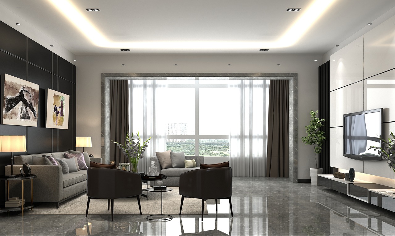
Every room needs a base. Whether it’s a large rug, a wall color, or a neutral sofa, you need something steady to anchor the space. This doesn’t mean everything must be plain. But starting with one solid, quiet element gives your patterns something to play off of. It provides visual rest. Without it, the eye has nowhere to land. Designers often begin with one central piece in a neutral tone or a low-contrast texture. This helps other elements shine without the space feeling chaotic. It also gives you more freedom to add layers without the risk of crashing.
Limit the Number of Bold Patterns
Using more than one bold print in a room can work but it needs structure. Too many can compete for attention and disrupt the balance. Choose one strong pattern to lead. Let it set the tone for everything else. This could be a geometric rug, a floral curtain, or a large-scale wallpaper. Once that’s in place, other patterns should support it, not fight with it. Smaller-scale prints, subtle textures, or tone-on-tone designs can add variety without overwhelming the space. They complement the lead pattern and keep the room feeling cohesive. This kind of restraint ensures the visual flow stays smooth and deliberate.

Vary Scale and Type
One of the easiest ways to balance multiple patterns is by mixing scale. If your sofa has a large plaid pattern, pair it with smaller prints like narrow stripes or tiny dots. Mixing scale prevents the room from feeling cluttered. It also keeps each pattern visible instead of blending them into visual noise. Different types of prints also bring dimension. Organic shapes like leaves or florals soften graphic patterns like checks or stripes. This contrast adds interest while still maintaining harmony. Texture can also act as a type of pattern think boucle, linen, or woven details. These quieter elements can give the eye a break while adding to the overall design.
Stick to a Unified Color Palette
Color pulls everything together. Even if you’re mixing different styles of patterns modern, vintage, global a consistent color palette will keep them from feeling scattered. You don’t need to use the same shades repeatedly. But all colors should feel related. Choose a primary color and build around it. Add lighter, darker, or muted tones of the same hue. This gives the room a layered look while keeping it grounded. When done right, even contrasting patterns will feel like part of the same story.
Let Texture Create Depth
The texture is the quiet partner of the pattern. It doesn’t scream for attention, but it adds richness. A mix of smooth, rough, soft, and structured textures can help soften bold prints. They create balance without needing more color or shape. A velvet pillow next to a patterned one. A nubby throw draped over a graphic chair. These combinations feel intentional and composed. Texture also brings a tactile element to the design. It invites touch, which makes the space feel more comfortable and lived-in.

Use Negative Space Intentionally
One of the most effective tools in pattern-heavy spaces is negative space. This means blank walls, bare floors, or unadorned furniture. These quiet moments give the eye a break. They let patterns breathe and ensure the space doesn’t feel overcrowded. Don’t feel the need to fill every inch. A blank wall beside a busy wallpapered one can make that wallpaper stand out more. An empty tabletop can help a patterned rug below it feel more defined. These pauses are part of the design not a lack of it.
In Conclusion
Achieving balance with prints and textures isn’t usually done in one step. It’s a process. Add pieces gradually and step back to assess. Look at the room as a whole. Does it feel connected? Does anything stand out too much or not enough? Sometimes balance means removing something, not adding more. The utmost care in editing will help preserve the harmony in the room. Trust your instincts, but also give the space-time to speak. What feels off one day might make sense the next, or vice versa.…